This is a link to the final version of our film "The Last Line", which we uploaded onto Youtube:
http://www.youtube.com/user/WhatHappensInVegas10?feature=mhum#p/a/u/0/vHKhpem13UA
Tuesday, 3 May 2011
Sunday, 24 April 2011
Critical Evaluation
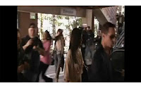
1) In our film we made sure our film followed the conventions of continuity this was to enable our audience to easily follow the storyline of our film. In our title sequence we used quite fast paced editing as the shots were from a photo shoot. We also on the flash of the camera added a freeze frame which allowed us to add the name of our actors for the 2 seconds the edit occurred for. This was similar to the film Snatch, which enabled the 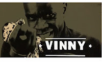 audience to know who the characters where. We challenged the 180 degree rule on one occasion on purpose as it allowed us to get a varied angle of our main character trying to get out of his car with the press surrounding him. We purposely did this as to add to the effect of the media frenzy. We
 used linear editing where the film started beginning to end; this allowed us to ensure that the audience understood fully what was happening in the film and also in some ways understand how our main character is slowly unravelling.
Drama Films are serious presentations or stories with settings or life situations that portray realistic characters in conflict with either themselves, others, or forces of nature. Dramatic themes can be alcoholism, drug addiction, racial prejudice, religious intolerance, poverty, crime and corruption, others, society and even natural phenomenon. http://en.wikipedia.org/wiki/Drama_film A dramatic film shows us human beings at their best, their worst, and everything in-between. That is why I would describe our film as a drama as it shows our main character at the beginning at his so called best and at the end his worst. We tried to stick to the main conventions of drama films on purpose as it would be the best way for our audience to understand our main characters situation. The sub-genre of our film is tragedy as our film shows “Connor’s” downfall which is caused by a flaw in his character and error in his judgement.
 In our film we have used inspiration from the TV programme Dirt which showed a press frenzy which we took ideas from and incorporated it into our film. We also looked at the scene in Walk the Line where Johnny Cash is hounded by the press which helped us get inspiration as to what and how our press should be reacting in the presence of the so called “star”. We used mostly biopics as inspiration for our film as these showed big stars and the pressures they are under. Films like Ali, Walk the Line, I’m Not There and Milk proved to be very good films to help us shoot our film mainly because they were the type of film most similar to our own apart from our story is not about an actual famous person, but loosely around the many incidents where a celebrity has become overcome by fame.
In our film the kind of audience pleasure we wanted to try to provide is using Laura Mulvey’s visual pleasure & narrative cinema. We wanted our audience to have the feeling of scopophilia this is where the audience feel like they are looking at someone (voyeurism) and they cannot see them. We also wanted the audience to have the sense of identification with the main character and identify some of our main character traits especially at the height of “Connor’s” career.
 audience to know who the characters where. We challenged the 180 degree rule on one occasion on purpose as it allowed us to get a varied angle of our main character trying to get out of his car with the press surrounding him. We purposely did this as to add to the effect of the media frenzy. We
 used linear editing where the film started beginning to end; this allowed us to ensure that the audience understood fully what was happening in the film and also in some ways understand how our main character is slowly unravelling.
Drama Films are serious presentations or stories with settings or life situations that portray realistic characters in conflict with either themselves, others, or forces of nature. Dramatic themes can be alcoholism, drug addiction, racial prejudice, religious intolerance, poverty, crime and corruption, others, society and even natural phenomenon. http://en.wikipedia.org/wiki/Drama_film A dramatic film shows us human beings at their best, their worst, and everything in-between. That is why I would describe our film as a drama as it
 shows our main character at the beginning at his so called best and at the end his worst. We tried to stick to the main conventions of drama films on purpose as it would be the best way for our audience to understand our main characters situation. The sub-genre of our film is tragedy as our film shows “Connor’s” downfall which is caused by a flaw in his character and error in his judgement.
 In our film we have used inspiration from the TV programme Dirt which showed a press frenzy which we took ideas from and incorporated it into our film. We also looked at the scene in Walk the Line where Johnny Cash is hounded by the press which helped us get inspiration as to what and how our press should be reacting in the presence of the so called “star”. We used mostly biopics as inspiration for our film as these showed big stars and the pressures they are under. Films like Ali, Walk the Line, I’m Not There and Milk proved to be very good films to help us shoot our film mainly because they were the type of film most similar to our own apart from our story is not about an actual famous person, but loosely around the many incidents where a celebrity has become overcome by fame.
In our film the kind of audience pleasure we wanted to try to provide is using Laura Mulvey’s visual pleasure & narrative cinema. We wanted our audience to have the feeling of scopophilia this is where the audience feel like they are looking at someone (voyeurism) and they cannot see them. We also wanted the audience to have the sense of identification with the main character and identify some of our main character traits especially at the height of “Connor’s” career.
Critical Evaluation
2) In our main production, the whole concept was to show Connor as a successful actor who was looked up to and respected, then to his downfall as the pressures of fame takeover his life and cause chaos and destruction. To convey these ideas we wanted the audience to at first look-up to Connor, then in comparison feel sorry for him. In our two advertising products we wanted to convey the film and its subjects.
 For our poster, we researched into existing film posters from similar style films like “I'm not there” Bob Dylan biopic, “Aviator” Howard Hughes biopic and “Ali” Muhammad Ali biopic. The posters from “I’m Not There” and “Ali” both had a similar style which featured just the main character on the poster which enabled the poster not to give too much away. In comparison “Aviator” featured a plane in the background which is a key part of the story, but in our poster we didn’t want to reveal too much about the storyline of our film. For our film poster, we decided to use images from the
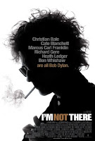 photo-shoot in our title sequence as the main image in the poster, but the only problem was we wanted an image that had a light and dark side to show the two sides to Connor’s story and a simple look on his first as
 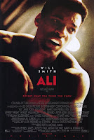 well for the same reason. By using an image like this we thought that it would intrigue the audience as to want the film is about. We made the title to the film quite large as to attract the audience and added an underline tool as to fit with “The Last LINE” part of our title. We incorporated the tagline “Is Fame really worth it?” as it is a question to the audience which helps to engage and to keep the film in their minds.
Next we created a thought provoking radio trailer to sell our production and again we didn’t reveal too much of the storyline so that the audience was left guessing about the themes of the film. When we tried to research existing trailers we were unable to find any, however we decided that if we found trailers on YouTube they would be very similar to the radio trailers only without sound. We added some dialogue to the trailer in order to establish a rough outline to the story. Using Garage Band, we incorporated sound from Connor’s interview to establish who he is and an argument with his girlfriend to convey his current mental state. We included a voiceover of Connor as well, which gave the audience a feel of how he was feeling and how tense he is at that moment. We wanted to ensure that our trailer along with fitting with our style of film also fitted with our chosen genre, we think that using the selected bits of dialogue really enabled us to achieve this. We created an overall narrative voiceover for the trailer which came in in-between the dialogue from our film. This voiceover allowed us to incorporate important information about our film like the storyline, the creators and the release date. In our film we used music from I Am Not Left Handed – boatsbutnottheocean. We incorporated this song as it really fitted in well with our film, so we decided that it would be appropriate for our trailer. We focused on just the sound of the trailers in order to research how blockbusters market their films.
 For our poster, we researched into existing film posters from similar style films like “I'm not there” Bob Dylan biopic, “Aviator” Howard Hughes biopic and “Ali” Muhammad Ali biopic. The posters from “I’m Not There” and “Ali” both had a similar style which featured just the main character on the poster which enabled the poster not to give too much away. In comparison “Aviator” featured a plane in the background which is a key part of the story, but in our poster we didn’t want to reveal too much about the storyline of our film. For our film poster, we decided to use images from the
 photo-shoot in our title sequence as the main image in the poster, but the only problem was we wanted an image that had a light and dark side to show the two sides to Connor’s story and a simple look on his first as
  well for the same reason. By using an image like this we thought that it would intrigue the audience as to want the film is about. We made the title to the film quite large as to attract the audience and added an underline tool as to fit with “The Last LINE” part of our title. We incorporated the tagline “Is Fame really worth it?” as it is a question to the audience which helps to engage and to keep the film in their minds.
Next we created a thought provoking radio trailer to sell our production and again we didn’t reveal too much of the storyline so that the audience was left guessing about the themes of the film. When we tried to research existing trailers we were unable to find any, however we decided that if we found trailers on YouTube they would be very similar to the radio trailers only without sound. We added some dialogue to the trailer in order to establish a rough outline to the story. Using Garage Band, we incorporated sound from Connor’s interview to establish who he is and an argument with his girlfriend to convey his current mental state. We included a voiceover of Connor as well, which gave the audience a feel of how he was feeling and how tense he is at that moment. We wanted to ensure that our trailer along with fitting with our style of film also fitted with our chosen genre, we think that using the selected bits of dialogue really enabled us to achieve this. We created an overall narrative voiceover for the trailer which came in in-between the dialogue from our film. This voiceover allowed us to incorporate important information about our film like the storyline, the creators and the release date. In our film we used music from I Am Not Left Handed – boatsbutnottheocean. We incorporated this song as it really fitted in well with our film, so we decided that it would be appropriate for our trailer. We focused on just the sound of the trailers in order to research how blockbusters market their films.
We researched film trailers from “The Kings Speech” http://www.youtube.com/watch?v=OsxjM03ME7s&feature=fvst and “The Fighter” http://www.youtube.com/watch?v=71l-kIhJ5j8 . These trailers were really useful as they came from very successful films, which obviously proved that their marketing worked. They both used key features of their films to sell them to the audience and “The Kings Speech” in particular focused on the music used in the background as it was quite fitting and memorable. The main difference between these film trailers and our radio trailer was that the release dates and production companies were all visual on the screen so in comparison we had to include these in our voiceover. On Blogger I researched these two different radio trailers:
http://whathappensinvegas10.blogspot.com/2011/02/radio-trailers-research.html
This is our finished radio trailer for “The Last Line”:
This is our finished radio trailer for “The Last Line”:
Critical Evaluation
3) At the planning stage of our porduction we carried out research in the form of a video questionnaire which helped us to better understand what the audience wanted from a drama film. http://whathappensinvegas10.blogspot.com/2010/10/video-questionniare.html
We asked a sample group of our target audience which were teens of both genders some questions relating to our film to find out whether our proposed film would be suited to our selected age group. The main outcome of this research was that everyone thought that celebrities are often heavily pressured by the media, this then influenced us to ensure in our film we showed Connor being hounded by the press. We outlined our film to our sample group and asked them what certificate they thought in would be, their response was a 15 as we included drug taking, but not in a glamourised way. In our film we decideded we wanted a sad ending, although this differed from what the audience prefered we thought it would be a much more fitting ending to our film as it showed how the pressures can lead to someones downfall. We took one answer in particular as quite important, we asked how would that person react if they were followed by the press and they answered “probably kill myself” which our main character penultimately did. We showed Connor hitting a member of the paparzzi, then stumbling back inside where the audience hear a gunshot and see the paparazzi run in. We created this scene as the final shot of the film to overwhelm the audience, the strength of the gunshot we believe will have an impact on the audience and make them feel bad for Connor.
In the filming and editing stage of our process, we ensured meaning would be apparent to the audience by initially showing who Connor is (a celebrity) and the way he is constantly followed and in the titles by showing a photo-shoot we thought that this would make the audience believe that occasions like this are part of his everyday life. We also added a voiceover in the film, this enabled us to use our main character and establish his feelings in the situations we showed which meant the audience had a deeper understanding of what was happening in the film. Although we added the voiceover for another reason, this was to cover the sound of the wind in the paparazzi scene.
On completion of our film, we uploaded a full version of “The Last Line” onto the video sharing site YouTube. This wasn’t a completed version of our film as we wanted to trial aspects of our film in order to gain feedback from our target audience. We sent a link to a selected group of our friends, who were in our target audience age range on Facebook through a private email and asked to them their opinions on the film and to be specific when giving feedback. This is a print screen of the email we sent.
This is the feedback we received:
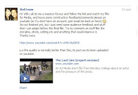 The positive feedback we obtained included that we used good canted angle shots in the final scene to show that something was right and they said that the music we chose fitted in very well with our film which I think was because it fitted in with the situations. Other feedback included that our film looked very professional and the props fitted in well. The criticisms we got were in the interview
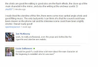 sequence near the beginning the sound was too quiet and this was also the case with the news broadcast at the end telling people about Connor’s death. To improve this we increased the sound levels on both parts. Another comment was to establish our main character more at the beginning, so we decided that we would add newspaper clippings and headlines to the interview scene to inform the audience more and also to make this scene more interesting as some people commented that this scene was too long. When we added the images we had to ensure this scene looked realistic so we checked the internet for celebrity interviews and images are a common
 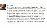 feature. Finally to improve our ending, one person suggested that to make the scene more powerful instead of a bang we should add a gunshot noise. We added this noise from a sounds database and we feel it really did create a much more powerful ending to our film. Overall, we were really happy with the feedback the audience gave and we really benefited from the constructive criticism as well as it helped us to improve the final outcome of our film.
We asked a sample group of our target audience which were teens of both genders some questions relating to our film to find out whether our proposed film would be suited to our selected age group. The main outcome of this research was that everyone thought that celebrities are often heavily pressured by the media, this then influenced us to ensure in our film we showed Connor being hounded by the press. We outlined our film to our sample group and asked them what certificate they thought in would be, their response was a 15 as we included drug taking, but not in a glamourised way. In our film we decideded we wanted a sad ending, although this differed from what the audience prefered we thought it would be a much more fitting ending to our film as it showed how the pressures can lead to someones downfall. We took one answer in particular as quite important, we asked how would that person react if they were followed by the press and they answered “probably kill myself” which our main character penultimately did. We showed Connor hitting a member of the paparzzi, then stumbling back inside where the audience hear a gunshot and see the paparazzi run in. We created this scene as the final shot of the film to overwhelm the audience, the strength of the gunshot we believe will have an impact on the audience and make them feel bad for Connor.
In the filming and editing stage of our process, we ensured meaning would be apparent to the audience by initially showing who Connor is (a celebrity) and the way he is constantly followed and in the titles by showing a photo-shoot we thought that this would make the audience believe that occasions like this are part of his everyday life. We also added a voiceover in the film, this enabled us to use our main character and establish his feelings in the situations we showed which meant the audience had a deeper understanding of what was happening in the film. Although we added the voiceover for another reason, this was to cover the sound of the wind in the paparazzi scene.
On completion of our film, we uploaded a full version of “The Last Line” onto the video sharing site YouTube. This wasn’t a completed version of our film as we wanted to trial aspects of our film in order to gain feedback from our target audience. We sent a link to a selected group of our friends, who were in our target audience age range on Facebook through a private email and asked to them their opinions on the film and to be specific when giving feedback. This is a print screen of the email we sent.
This is the feedback we received:
 The positive feedback we obtained included that we used good canted angle shots in the final scene to show that something was right and they said that the music we chose fitted in very well with our film which I think was because it fitted in with the situations. Other feedback included that our film looked very professional and the props fitted in well. The criticisms we got were in the interview
 sequence near the beginning the sound was too quiet and this was also the case with the news broadcast at the end telling people about Connor’s death. To improve this we increased the sound levels on both parts. Another comment was to establish our main character more at the beginning, so we decided that we would add newspaper clippings and headlines to the interview scene to inform the audience more and also to make this scene more interesting as some people commented that this scene was too long. When we added the images we had to ensure this scene looked realistic so we checked the internet for celebrity interviews and images are a common
  feature. Finally to improve our ending, one person suggested that to make the scene more powerful instead of a bang we should add a gunshot noise. We added this noise from a sounds database and we feel it really did create a much more powerful ending to our film. Overall, we were really happy with the feedback the audience gave and we really benefited from the constructive criticism as well as it helped us to improve the final outcome of our film.
Critical Evaluation
4) We researched our film in various ways these included through research into films of a similar genre and a similar length using internet sets like http://www.bbc.co.uk/filmnetwork/. We even looked into TV programmes that had a similar storyline to our own which helped us to create a well developed script and enabled us to thoroughly plan our short film. The research we did into film posters also helped us when creating our own as we were able to look at similar genre films and the way in which their film  posters are designed in relation to the way we wanted our own to look. Then we moved on to planning, in this stage it thoroughly relied on our research as we were able to look at previous examples. We made a script, shot list, a storyboard and scouted locations. In this stage we encountered a few minor glitches as the location we intended to use “Wentworth Castle” ended up being a bad choice due its location and our struggle to get our extras there. We also had to contend with the British weather which at the time decided rain would be a good idea.
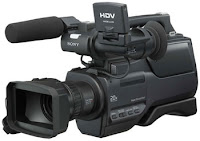
To film “The Last Line” we used a HDV1000 camera, the strengths of this particular camera are you have more control over the white balance which enables you to get a very high quality shot, which looks real. You can also film in widescreen on that camera so we got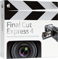 some very good wide angle shots which helped to establish our settings. We then took our footage and edited it with Final Cut Express, this year we obviously had a better understanding of the software and I think that our final outcome was of a much higher quality. We used better effects like a Flashframe, which appeared like a camera flash which was particularly appropriate for the style of our film. We kept our editing continuous
  and on most occasions kept to the 180 degree rule. When we did differ it was done properly and was done on purpose. We encountered another problem when uploading somehow our film had been shot monotone which meant our sound was very quite, to correct this we had to double up the sound to enable the audience to be able to hear dialogue.
For our sound, we chose to use music from bands not currently signed to a label these way “I am not left-handed” and “This ain’t Hollywood” we chose these bands as they most suited to our film and also gives unsigned artists some recognition. We found these artists from the website from Jamendo http://www.jamendo.com/en/ which was very useful as it provided a wide range of music to choose from. We used GarageBand software to create our radio trailer, which was a new experience as in our last film we never created any soundtracks or radio trailers. We also used Photoshop to create our film poster, which again for some of the members of our group was a new experience. To evaluate our film, we uploaded it to You-tube which is a video uploading sight, we then using Facebook asked friends and family to give a review of our film which helped us to get the feedback we needed to evaluate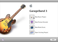 our film and make improvements.. Through this type of evaluation we were able to get the best type of feedback because it came from our actual target audience. This year we have really extended our knowledge of digital technologies and used a lot more different types of software etc. Through this I think that I have developed creatively this year.
 posters are designed in relation to the way we wanted our own to look. Then we moved on to planning, in this stage it thoroughly relied on our research as we were able to look at previous examples. We made a script, shot list, a storyboard and scouted locations. In this stage we encountered a few minor glitches as the location we intended to use “Wentworth Castle” ended up being a bad choice due its location and our struggle to get our extras there. We also had to contend with the British weather which at the time decided rain would be a good idea.
To film “The Last Line” we used a HDV1000 camera, the strengths of this particular camera are you have more control over the white balance which enables you to get a very high quality shot, which looks real. You can also film in widescreen on that camera so we got
 some very good wide angle shots which helped to establish our settings. We then took our footage and edited it with Final Cut Express, this year we obviously had a better understanding of the software and I think that our final outcome was of a much higher quality. We used better effects like a Flashframe, which appeared like a camera flash which was particularly appropriate for the style of our film. We kept our editing continuous
  and on most occasions kept to the 180 degree rule. When we did differ it was done properly and was done on purpose. We encountered another problem when uploading somehow our film had been shot monotone which meant our sound was very quite, to correct this we had to double up the sound to enable the audience to be able to hear dialogue.
For our sound, we chose to use music from bands not currently signed to a label these way “I am not left-handed” and “This ain’t Hollywood” we chose these bands as they most suited to our film and also gives unsigned artists some recognition. We found these artists from the website from Jamendo http://www.jamendo.com/en/ which was very useful as it provided a wide range of music to choose from. We used GarageBand software to create our radio trailer, which was a new experience as in our last film we never created any soundtracks or radio trailers. We also used Photoshop to create our film poster, which again for some of the members of our group was a new experience. To evaluate our film, we uploaded it to You-tube which is a video uploading sight, we then using Facebook asked friends and family to give a review of our film which helped us to get the feedback we needed to evaluate
 our film and make improvements.. Through this type of evaluation we were able to get the best type of feedback because it came from our actual target audience. This year we have really extended our knowledge of digital technologies and used a lot more different types of software etc. Through this I think that I have developed creatively this year.
Thursday, 21 April 2011
Critical Evaluation
1) In what ways does the media product use, develop or challenge forms and conventions of real media products?
I believe we observed the conventions of continuity because our film, (The Last Line), flow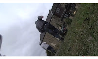 s quite smoothly due to editing, apart from one jump cut and canted angle which are deliberately there. The reason being to look as though it is from a photographers point of view as they have dropped the camera onto the floor, (jagged and bumpy etc).
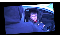 Following the storyline of our film, we show Connor as a celebrity by showing a photo-shoot, interview and paparazzi following him, as well as photos at the end of the film, and the sound of a camera. We also added a freeze frame during when Connor is buying the drugs. This was to relate to our storyline and make it look like he has been caught out, or pictured, during when he is at an all time low in his life. We also shot this at high angle looking down at him to show him at a low point.

Throughout our film there are some moments where the audience will hint reference to another film; firstly in the titles. During the titles (photo shoot), we added a freeze frame, which began with a flash (to give the idea it was a camera), then added the names of the actors.

This idea was taken from the film “snatch”, as the titles in this film are similar and we liked the idea.
I believe we observed the conventions of continuity because our film, (The Last Line), flow
 s quite smoothly due to editing, apart from one jump cut and canted angle which are deliberately there. The reason being to look as though it is from a photographers point of view as they have dropped the camera onto the floor, (jagged and bumpy etc).
We stuck to the 180° rule, throughout our film, (e.g. in the interview scene), however broke the conventions of this rule during the first press scene; in order to see the main character - Connor. The first angle was from the left hand side and then we switched to the right hand side to see Connor get out of the car as he is the main character and it was important to get his point of view while having the voiceover over it. We also observed the conventions of continuity, by using a match on action, where Lucy snatches the bottle out of Connors hand. We used a range of shots such as close up, long shot, high/low angle and used different ones to create effect, (e.g. high angle, looking down on him when he is depressed) as this follows the language of film and editing.
We have edited our film, by generally using cuts, however added fades i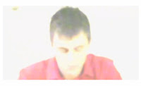 n and out to show passing of time. We used flashes throughout out film for effect and to look like camera flashes, which reminds the audience of the storyline, (celebrities, paparazzi etc). This is a flash used in our film.
“The Last Line” is in chronological order which is controlled by editing as it was edited together continuously. We also adjusted the length of the shots to add rhythm to our film and to make it flow better.
The genre for our short film is drama. I believe that we reflected the conventions as we added music which created a dramatic feel and also sympathy at the part where we wanted the audience to feel sorry for him. We added a song that was quite sad over the last part of the film, (I Am Not Left Handed- Boats but not the Ocean), that fitted very well with the context of the film and we also added a more upbeat song to the titles, as that was a more positive time in his life and career. The words of this song also added drama, as it had the lyrics “I can feel the changes coming...”, which may give the audience a hint of the storyline. Our film fulfils the nature of the genre because drama’s show human beings at their best, worst and everything in-between, which our film does. Drama’s can also include drug addiction, corruption of power, alcoholism and violence towards women, which I think our film contains.
 n and out to show passing of time. We used flashes throughout out film for effect and to look like camera flashes, which reminds the audience of the storyline, (celebrities, paparazzi etc). This is a flash used in our film.
“The Last Line” is in chronological order which is controlled by editing as it was edited together continuously. We also adjusted the length of the shots to add rhythm to our film and to make it flow better.
The genre for our short film is drama. I believe that we reflected the conventions as we added music which created a dramatic feel and also sympathy at the part where we wanted the audience to feel sorry for him. We added a song that was quite sad over the last part of the film, (I Am Not Left Handed- Boats but not the Ocean), that fitted very well with the context of the film and we also added a more upbeat song to the titles, as that was a more positive time in his life and career. The words of this song also added drama, as it had the lyrics “I can feel the changes coming...”, which may give the audience a hint of the storyline. Our film fulfils the nature of the genre because drama’s show human beings at their best, worst and everything in-between, which our film does. Drama’s can also include drug addiction, corruption of power, alcoholism and violence towards women, which I think our film contains.
 Following the storyline of our film, we show Connor as a celebrity by showing a photo-shoot, interview and paparazzi following him, as well as photos at the end of the film, and the sound of a camera. We also added a freeze frame during when Connor is buying the drugs. This was to relate to our storyline and make it look like he has been caught out, or pictured, during when he is at an all time low in his life. We also shot this at high angle looking down at him to show him at a low point.
Throughout our film there are some moments where the audience will hint reference to another film; firstly in the titles. During the titles (photo shoot), we added a freeze frame, which began with a flash (to give the idea it was a camera), then added the names of the actors.

This idea was taken from the film “snatch”, as the titles in this film are similar and we liked the idea.

We also took ideas from the TV programme ‘Dirt’, for our press scenes as in ‘Dirt’, there is a scene where paparazzi are following celebrities and being pushy and we liked this idea and incorporated it into our film. Our film is a biographical film as it dramatizes the life of one person, and comprehensively tells a person’s life story. There are many other biographical films which ours may hint at a reference to, such as ‘The Fighter’, ‘Ali’ and ‘Erin Brokovich’, however we have not deliberately taken any ideas from these films.
Through our short film, the kind of audience pleasure we are trying to achieve at first is personal identity. This is because we want to show the main character Connor, as a successful actor and a role model. We also want to make the audience feel sorry for him towards the end of the film and I am confident we achieved this as we added dramatic music and voiceovers explaining his situation. Our short film can also give the audience intensity, (as there are highs and lows of emotion throughout the film), and transparency (as the voiceovers give the audience more of an insight into his life). Laura Mulveys scopophilia approach relates to our film also, as the audience will be watching Connor and looking into his life without him being able to see them. Our film may also be used simply for entertainment, relaxation or just to fill time - relating to Richard Dyers theory.
Through our short film, the kind of audience pleasure we are trying to achieve at first is personal identity. This is because we want to show the main character Connor, as a successful actor and a role model. We also want to make the audience feel sorry for him towards the end of the film and I am confident we achieved this as we added dramatic music and voiceovers explaining his situation. Our short film can also give the audience intensity, (as there are highs and lows of emotion throughout the film), and transparency (as the voiceovers give the audience more of an insight into his life). Laura Mulveys scopophilia approach relates to our film also, as the audience will be watching Connor and looking into his life without him being able to see them. Our film may also be used simply for entertainment, relaxation or just to fill time - relating to Richard Dyers theory.
Critical Evaluation
2) How effective is the combination of your main product and the ancillary texts? In our main production, we were trying to firstly show Connor as a successful actor (and a role model), and then sadness and feeling sorry for him as he succumbs to the pressures of fame. We also wanted to show the audience that fame can wreck people’s lives, and how the pressures of fame can finally make celebrities lose control.
On our poster, we had just one large photo of the main character (Connor), and this was so it was eye-catchin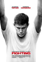 g, appealing and to show that he is the centre of attention in the film.
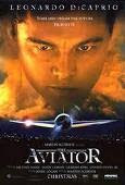
We researched existing film posters, and got this idea from the film posters for “Fighting”, and “Aviator”.
However the film poster for Aviator, shows a picture of the plane, (which is also a main part of the film), however we did not want to incorporate this feature into our film, (for example, by adding a camera to show that he is a celebrity), as we didn’t want to give too much away to the audience.
When we took the photo, we tried to get the shadowing was just right so one side of him was dark and the other was light, showing that he had something to hide. We altered the shadowing on photoshop, to looks slightly darker than it was on one side, as this created more effect. Connor also had a negative/depressed look on his face which maybe showed the audience that it is a sad film, however could help to sell our production as they would want to find out why. We made the title of the film larger to attract the audience’s eye, and also underlined it, (which was effective as it relates to the title, “The Last Line”). The names of the main characters are al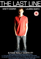 so in quite a large font, with a very appealing slogan, “Is Fame really worth it?” which may also help in the selling of our production as it is engaging. This is our final film poster:
I also think our radio trailer is quite effective for selling our production, as we don’t give too much away to the audience, which again will keep them guessing. We put some dialogue into the trailer, which includes Brett during the interview, (to establish that he is a celebrity), and also an argument with his girlfriend, “Lucy”. We had a voiceover of Brett as well, telling his situation slightly which sounded emotional and created drama – linking with our genre. Throughout the trailer, we had the song from our film (I Am Not Left Handed- Boats but not the Ocean) as it is quite a sad song and fits in well. We created our own narrative voiceover for the radio trailer which fitted in between dialogue from the film. This gave details of the film, and gave a little information regarding the storyline, so our audience knew what the film was about and whether it is something they would be interested in; therefore this would be used as a selling point. When researching existing trailers, we weren’t able to find any actual radio trailers, however got existing film trailers from ‘YouTube’, and just listened to them rather than looking at the visual aspects of it also. This was so we could listen to what features previous films had used for the selling of their production, and from there we got ideas and created our own. Previous trailers we researched included “The Fighter”, radio trailer http://www.youtube.com/watch?v=71l-kIhJ5j8 and “The Kings Speech” http://www.youtube.com/watch?v=OsxjM03ME7s&feature=fvst. These trailers were very useful as they had main parts of dialogue from the film, which gave the audience an insight into the storyline and also sounded interesting, therefore was effective in the selling of the actual film. As these are film trailers, and ours is a radio trailer, a main difference is that the information regarding the film (such as title, release date, production company), was in the form of text on the screen, whereas we gave this information in the voiceover. The previous trailers, (all being high-budgeted, Hollywood blockbusters), also showed the names of the main actors, which we didn’t do. However, I don’t believe this would have helped in the selling of our production, as the main actor isn’t a Hollywood star and so wouldn’t have attracted the audience to watch our film, purely because he is in it and his fans would want to watch him. This is a post we did on ‘blogger’, on research of previous trailers. http://whathappensinvegas10.blogspot.com/2011/02/radio-trailers-research.html And this is 'The Last Line"'s finished radio trailer. http://whathappensinvegas10.blogspot.com/2011/04/last-line-radio-trailer.html
On our poster, we had just one large photo of the main character (Connor), and this was so it was eye-catchin
 g, appealing and to show that he is the centre of attention in the film.
We researched existing film posters, and got this idea from the film posters for “Fighting”, and “Aviator”.
However the film poster for Aviator, shows a picture of the plane, (which is also a main part of the film), however we did not want to incorporate this feature into our film, (for example, by adding a camera to show that he is a celebrity), as we didn’t want to give too much away to the audience.
When we took the photo, we tried to get the shadowing was just right so one side of him was dark and the other was light, showing that he had something to hide. We altered the shadowing on photoshop, to looks slightly darker than it was on one side, as this created more effect. Connor also had a negative/depressed look on his face which maybe showed the audience that it is a sad film, however could help to sell our production as they would want to find out why. We made the title of the film larger to attract the audience’s eye, and also underlined it, (which was effective as it relates to the title, “The Last Line”). The names of the main characters are al
 so in quite a large font, with a very appealing slogan, “Is Fame really worth it?” which may also help in the selling of our production as it is engaging. This is our final film poster:
I also think our radio trailer is quite effective for selling our production, as we don’t give too much away to the audience, which again will keep them guessing. We put some dialogue into the trailer, which includes Brett during the interview, (to establish that he is a celebrity), and also an argument with his girlfriend, “Lucy”. We had a voiceover of Brett as well, telling his situation slightly which sounded emotional and created drama – linking with our genre. Throughout the trailer, we had the song from our film (I Am Not Left Handed- Boats but not the Ocean) as it is quite a sad song and fits in well. We created our own narrative voiceover for the radio trailer which fitted in between dialogue from the film. This gave details of the film, and gave a little information regarding the storyline, so our audience knew what the film was about and whether it is something they would be interested in; therefore this would be used as a selling point. When researching existing trailers, we weren’t able to find any actual radio trailers, however got existing film trailers from ‘YouTube’, and just listened to them rather than looking at the visual aspects of it also. This was so we could listen to what features previous films had used for the selling of their production, and from there we got ideas and created our own. Previous trailers we researched included “The Fighter”, radio trailer http://www.youtube.com/watch?v=71l-kIhJ5j8 and “The Kings Speech” http://www.youtube.com/watch?v=OsxjM03ME7s&feature=fvst. These trailers were very useful as they had main parts of dialogue from the film, which gave the audience an insight into the storyline and also sounded interesting, therefore was effective in the selling of the actual film. As these are film trailers, and ours is a radio trailer, a main difference is that the information regarding the film (such as title, release date, production company), was in the form of text on the screen, whereas we gave this information in the voiceover. The previous trailers, (all being high-budgeted, Hollywood blockbusters), also showed the names of the main actors, which we didn’t do. However, I don’t believe this would have helped in the selling of our production, as the main actor isn’t a Hollywood star and so wouldn’t have attracted the audience to watch our film, purely because he is in it and his fans would want to watch him. This is a post we did on ‘blogger’, on research of previous trailers. http://whathappensinvegas10.blogspot.com/2011/02/radio-trailers-research.html And this is 'The Last Line"'s finished radio trailer. http://whathappensinvegas10.blogspot.com/2011/04/last-line-radio-trailer.html
Subscribe to:
Comments (Atom)
